From a complex system to a clear and guided experience
01 — Overview
Project context
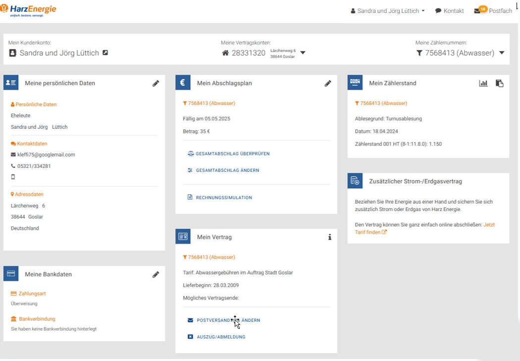
This project focuses on redesigning a self-service portal used in the energy sector.
The platform allows users to manage contracts, submit meter readings, and access billing information. However, the existing version had several usability and accessibility issues that made these tasks harder than they should be.
Users struggled with navigation, unclear structure, and inconsistent interactions.
The goal of this project was to analyze these issues and redesign the experience to make it clearer, more structured, and easier to use.
When looking at the existing portal, the issues were consistent across different areas.
Users struggled to understand where to go, what to do, and how to complete tasks.
The system lacked:
Clear structure and hierarchy
Predictable navigation
Consistent interaction patterns
Accessible and understandable feedback
What this really means is users had to figure the system out instead of being guided by it.
03 — Research
Understanding the problem
To understand where the issues came from, I analyzed the existing portal using a mix of evaluation methods and user-centered approaches.
This included usability reviews, accessibility checks, and observing how users interacted with the system.
H
Heuristic evaluation
Systematic audit against Nielsen’s 10 usability heuristics
A
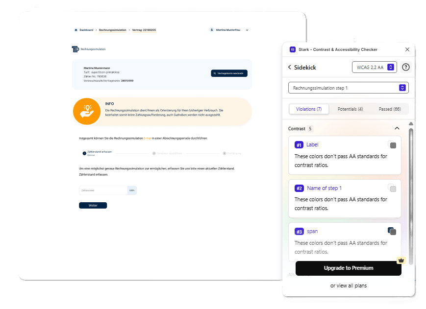
Accessibility audit
BITV 2.0 checklist against WCAG 2.2 AA/AAA levels.
P
UX modelling
3 persona types, scenario narratives, and customer journey maps
What became clear
Across all methods, the same patterns kept showing up.
Users struggled not because the tasks were complex, but because the interface made them hard to follow.
Important information was buried
Navigation didn’t match user expectations
Interactions were inconsistent
Feedback was unclear or missing
The system relied on users to figure things out, instead of guiding them.
04 — Design process
Stage 1 — Early Exploration
Exploring the structure
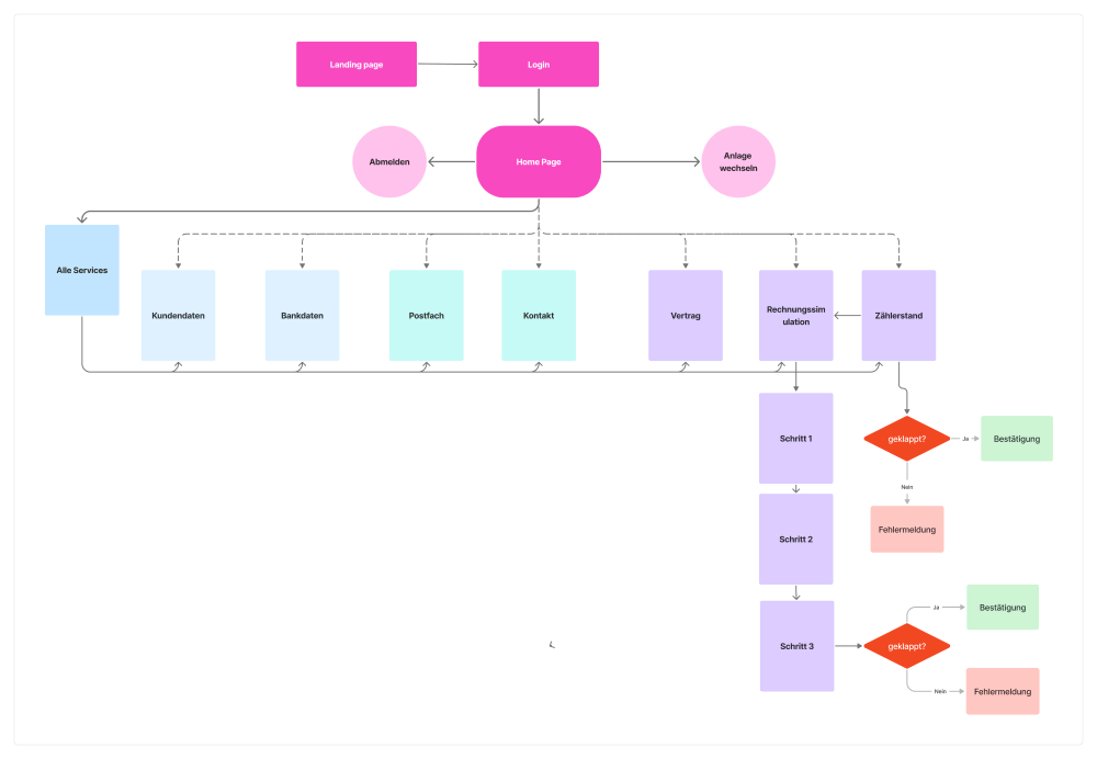
The first step was to rethink how information and tasks were structured.
Instead of presenting everything at once, I explored breaking tasks into smaller, more manageable steps.
Stage 2 — Design decisions
1. Structuring tasks into clear flows
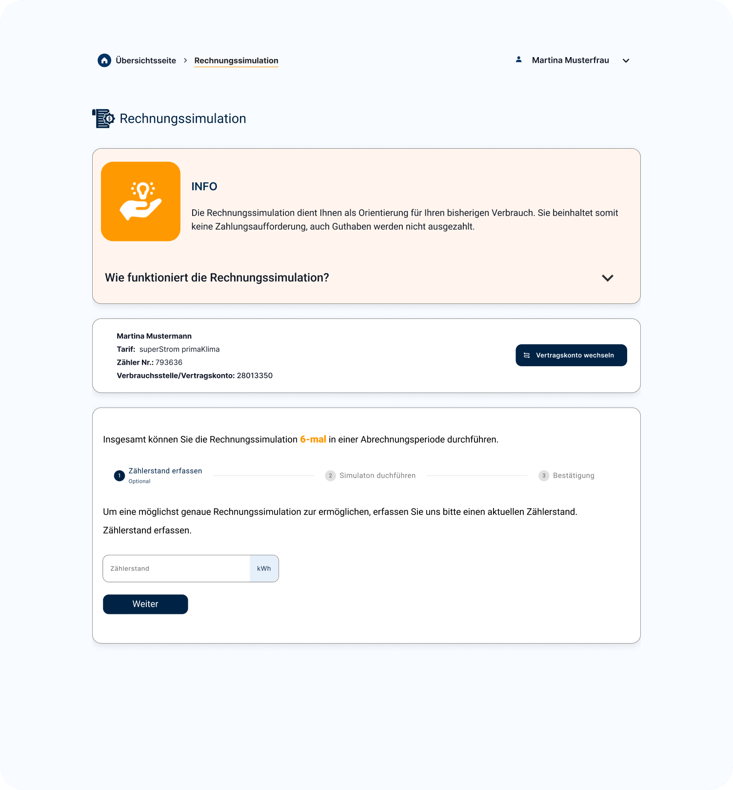
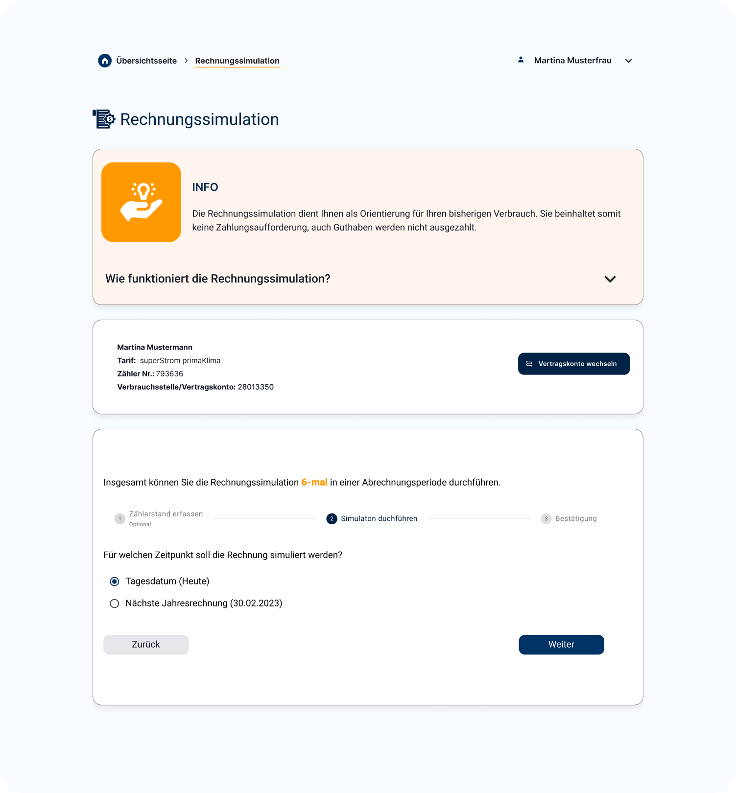
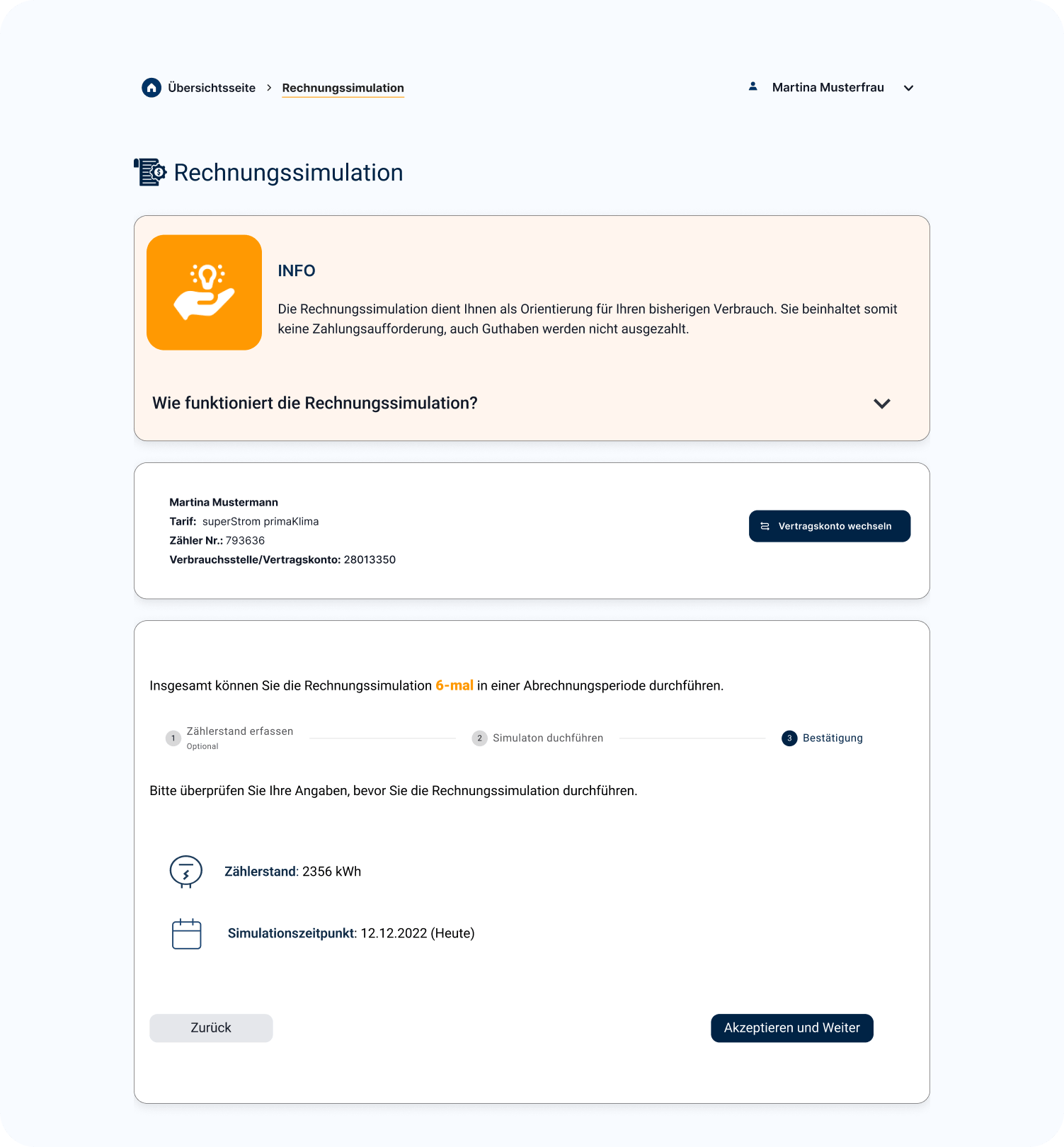
Instead of dense pages, tasks were broken into step-by-step processes to make them easier to follow.
2. Making navigation predictable
Clear navigation patterns and consistent terminology helped users understand where they were and what to do next.
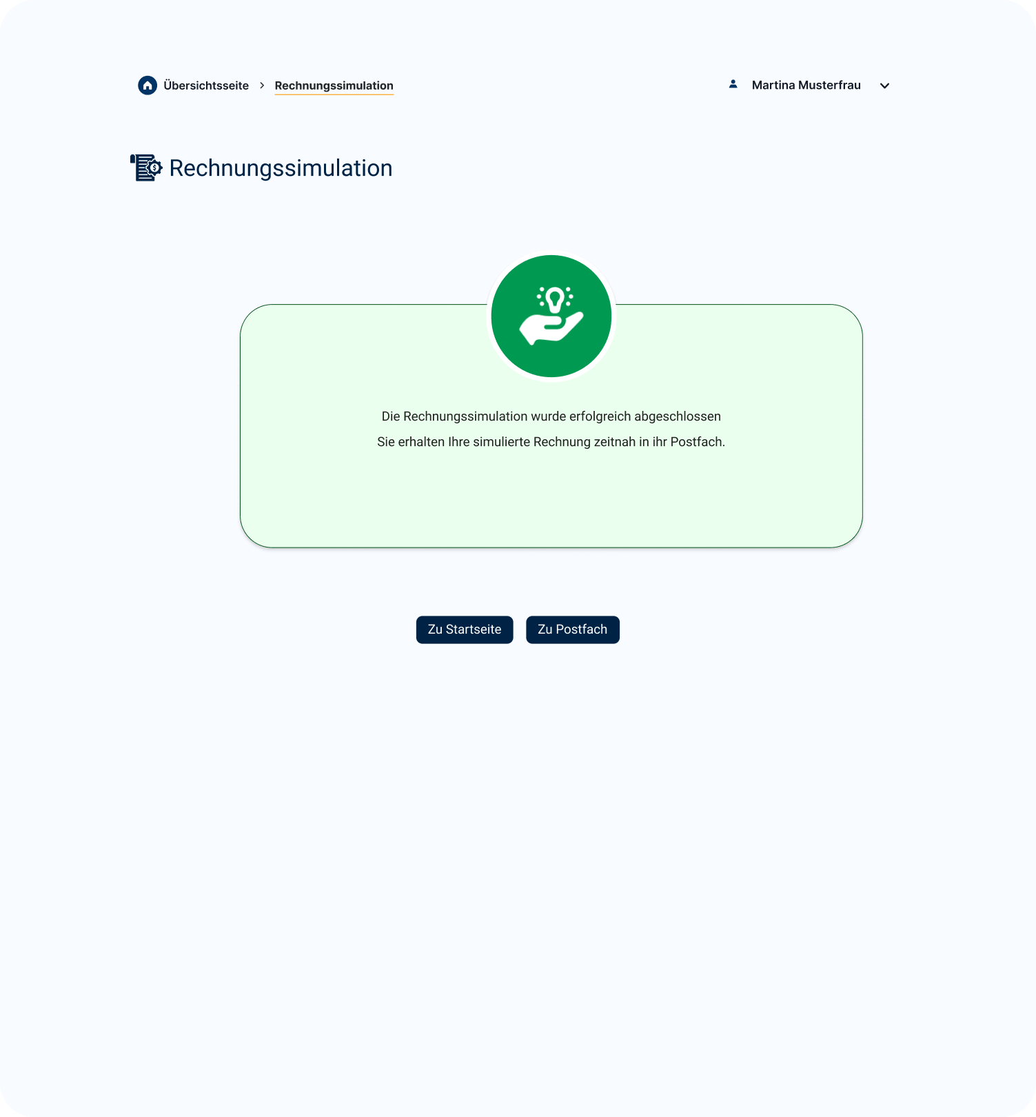
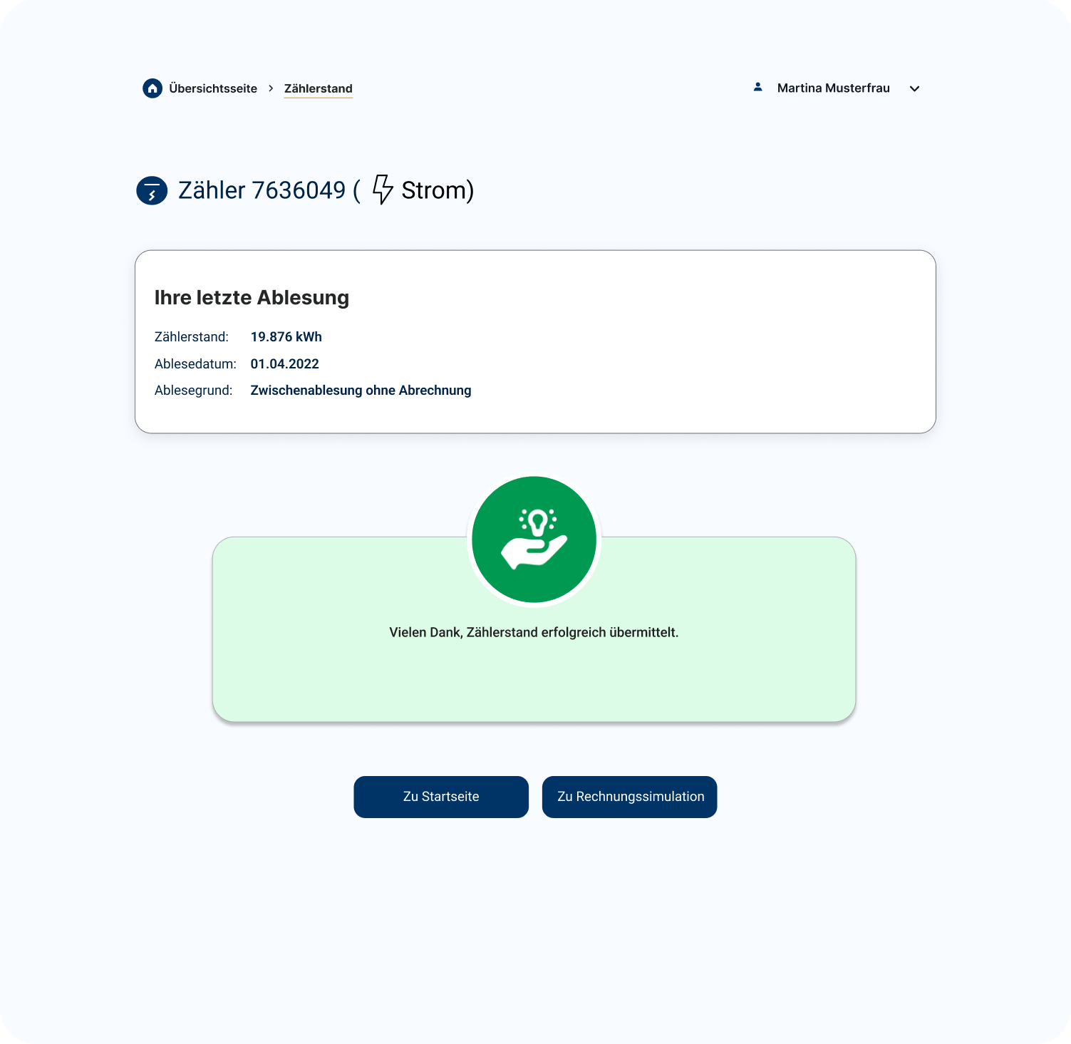
3. Improving system feedback
Error messages and feedback were redesigned to be clearer and more actionable.
4. Designing for Accessibility
Accessibility wasn’t treated as an add-on, but built into the design through clear contrast, readable typography, and inclusive interaction patterns.
Stage 3 — Final UI
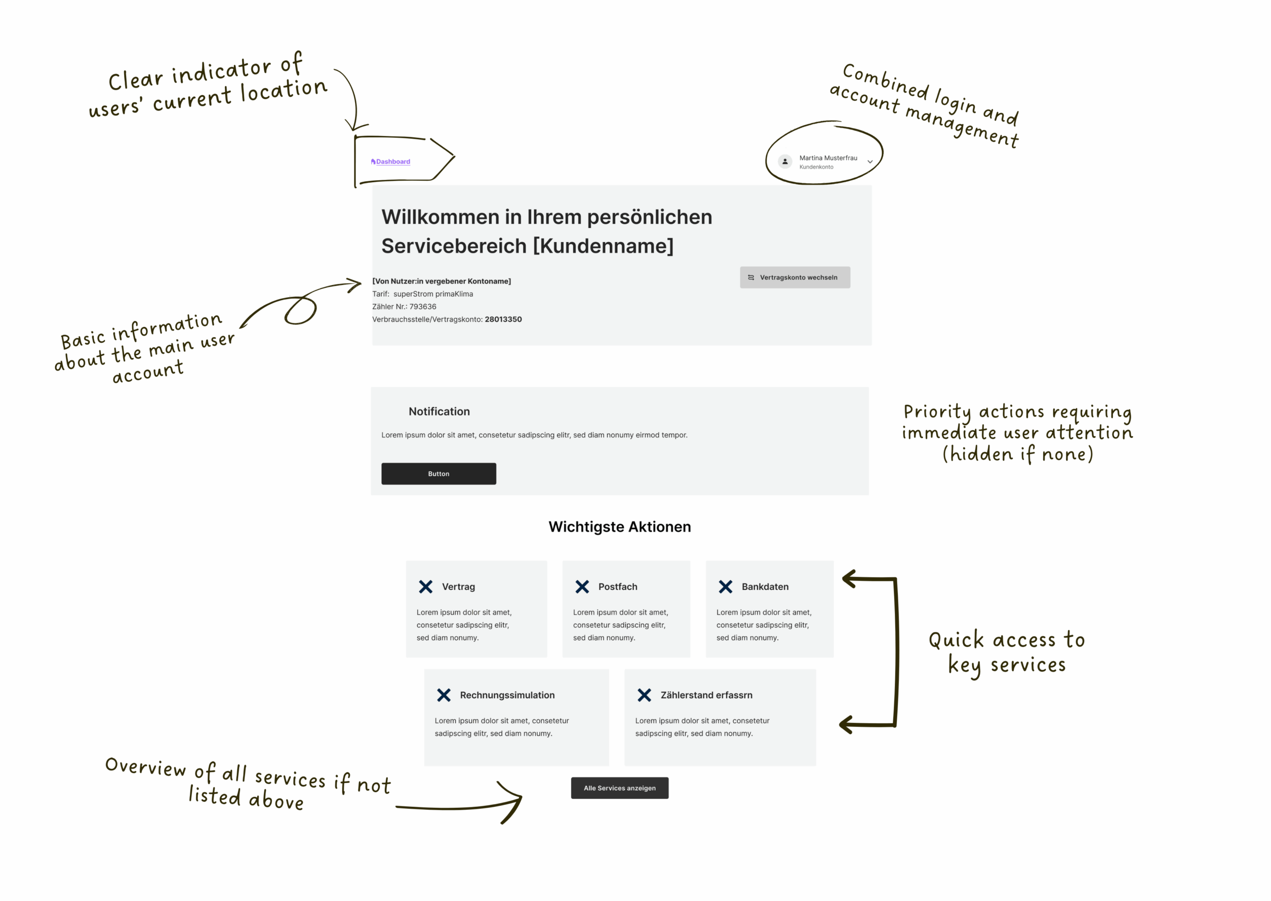
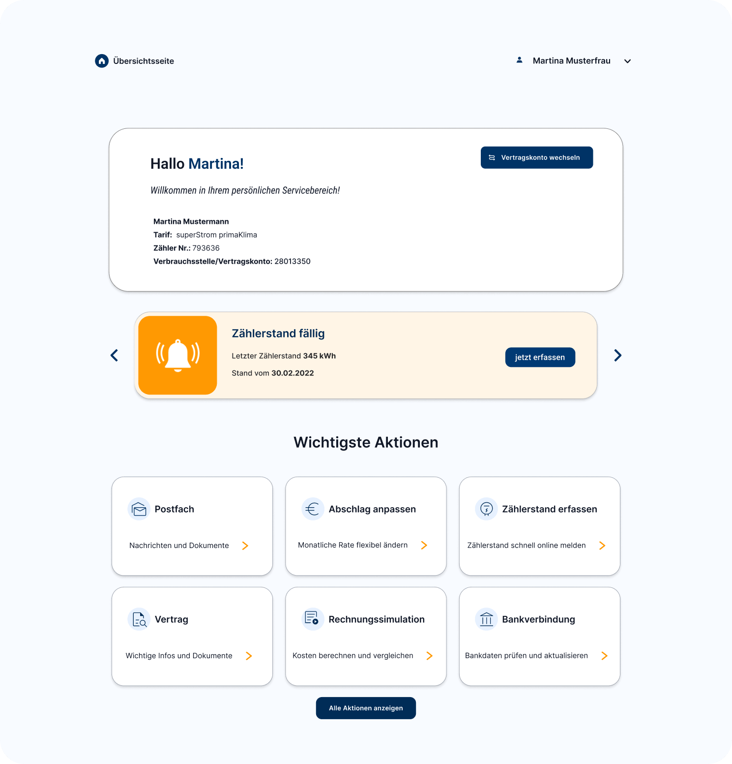
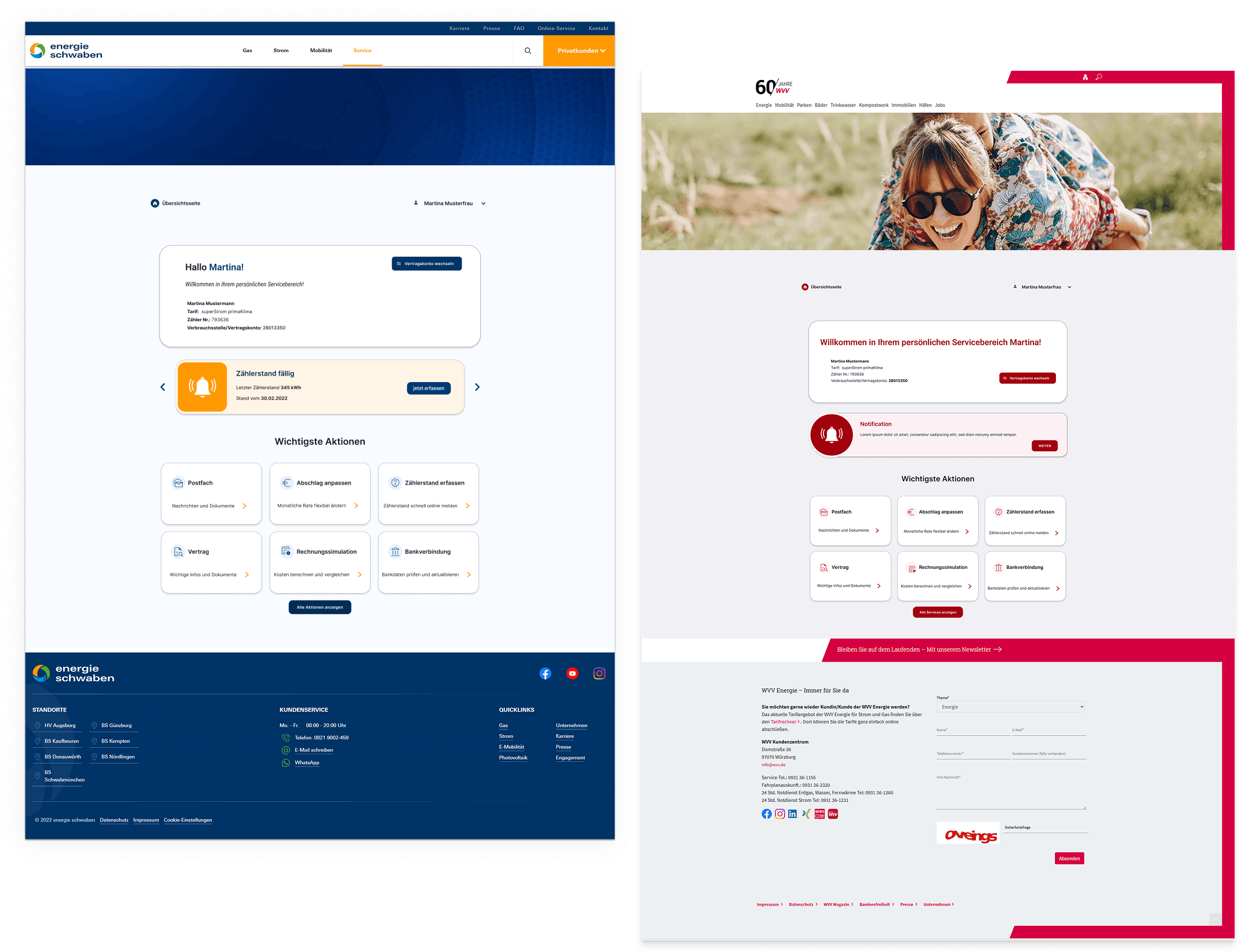
Dashboard
Clear structure and visual hierarchy help users quickly understand available actions.
Stage 3 — Final UI
Flow
Step-by-step interaction reduces confusion and guides users through tasks.
Stage 3 — Final UI
Feedback
Improved messages make system responses easier to understand.
05 — White-label system
Brand variations
One system. Many brands.
The token-based architecture allows the entire portal to re-skin to a new brand in minutes — without touching structure, interaction patterns, or accessibility compliance. All colour decisions are isolated in a single token layer.
Auto-generated shade & tint ramps from one primary colour
Typography, spacing, and border radius all token-controlled
Contrast ratios re-validated automatically per brand
06 — Results
Test
Testing the redesign
To evaluate the new design, usability tests were conducted with users completing key tasks.
The goal was to understand how easily users could navigate the system and complete actions.
Task-based testing
Single Ease Question (SEQ)
UMUX-LITE
6.1
Average SEQ score
out of 7 — above “easy” threshold
3
Core flows tested
meter · invoice · contract
11
Participants tested moderated usability sessions
AA
WCAG conformance
achieved in final version
Outcome
Final Version
The final version significantly improved the overall experience.
Users were able to navigate more easily, understand tasks more clearly, and complete actions with less effort.
The redesign led to:
Improved usability scores
Better task clarity and completion
Increased user confidence
More consistent and accessible interactions
07 — Outcomes
What I learned
This project taught me how to work with limited data and still derive meaningful insights for design decisions. It also helped me understand how to balance personalization, accessibility (BFSG/WCAG), and system consistency when redesigning a large-scale platform.
What’s next
The next step is to integrate real usage data and continue improving the system based on actual user behavior.