How can a complex energy self-service portal become simpler and more accessible?

+ CASE STUDY

Master Thesis

Energy customers use self-service portals to manage contracts, billing, and personal data.
The existing portal was functional but difficult to navigate and not fully accessible.

In my master’s thesis, I redesigned the portal to improve clarity, accessibility, compliance, and scalability for multiple energy providers.

Role: UX/UI Designer, UX Researcher

Type: Self Service Portal (Website) ​

Date: 2025

+ PROBLEM

What were the main challenges of the existing portal?

Structural Complexity

Unclear hierarchy, information overload, and weak navigation created a disorienting experience for users.

Accessibility Gaps

Accessibility standards were not fully embedded, creating structural barriers rather than inclusive interactions.

Lack of Scalable Brand Structure

The system was not built for multi-brand scalability, limiting flexibility across different energy providers.

+ Goal

So what are the Goals?

Build a scalable design concept

Reduce cognitive load

Improve task orientation

Ensure accessibility compliance (BFSG)

+Research

How did I understand the current experience?

CHALLENGE

Real user analytics data was not accessible due to security and data protection restrictions.

SOLUTION

I combined Heuristic Evaluation , Accessibility audits, and User behaviour analysis. This allowed me to identify structural weaknesses in navigation, hierarchy, and compliance with WCAG and BFSG standards. The analysis revealed a consistent pattern: users were not blocked by missing features, but by cognitive overload and unclear structure.

+ Design

The analysis revealed a clear pattern: the system was not broken ; it was overwhelming.

  • Users need stronger orientation and progressive disclosure.

  • Too much information increases cognitive stress.

  • Accessibility improvements benefit all users, not only specific groups.

  • Consistency across interaction patterns increases trust.

These insights directly shaped the redesign principles.

+ Design

Lo-Fi Designs

  • Before moving to visuals, I focused on structure.

    I redesigned:

    • Information architecture

    • Navigation hierarchy

    • Task flows

    • Dashboard prioritization

    Low-fidelity wireframes helped validate structure without being distracted by visual details.

    This allowed fast iteration and structural improvements early on.

Home ( Übersicht) (1) (1)

+ DEsign

Hi-Fi Designs

After validating the structure, I developed iterative high-fidelity prototypes in Figma.

The focus was on:

  • Clear visual hierarchy

  • Improved contrast and accessibility

  • Simplified dashboard layout

  • Consistent interaction components

+CHALLENGE

Did the new design meet UX standards?

After redesigning the portal, I reassessed my prototype using the same heuristic and accessibility criteria applied in the initial analysis. This ensured that improvements were measurable and not purely aesthetic. While navigation clarity and structure improved significantly, the evaluation revealed the need for further refinements in visual prioritization and interaction feedback. These insights guided the final iteration of the design.

+ DEsign

Hi-Fi Designs

After validating the structure, I developed two iterative high-fidelity prototypes in Figma.

The focus was on:

  • Clear visual hierarchy

  • Improved contrast and accessibility

  • Simplified dashboard layout

  • Consistent interaction components

+ RESEARCH

How can one system support multiple energy brands without breaking usability?

I found a solution!
The portal needed to support multiple energy providers while maintaining a consistent user experience.

Instead of designing separate versions for each brand, I developed a flexible white-label structure based on reusable components, modular layouts, and brand-independent interaction logic.

Design tokens for colors and typography allowed visual customization without affecting usability or accessibility standards.

This approach ensured scalability, reduced future redesign effort, and maintained a coherent experience across different brand identities.


+ TEST

Testing & Validation

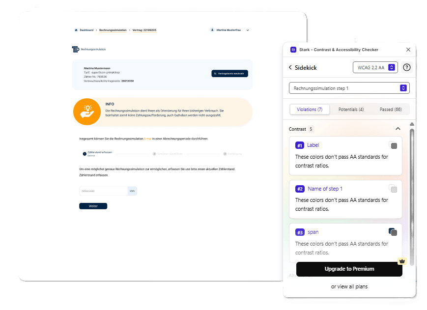
To validate the design, I conducted moderated usability interviews to evaluate how users interact with the redesigned portal. The results showed generally positive usability, while also revealing areas that required further improvement.

  • 11 participants in moderated usability interviews

  • 3 key tasks tested (meter reading, bill simulation, address change)


5.9 / 7

Average SEQ score

82 / 100

UMUX-Lite score

+ Reflection

What I Learned

This project taught me how to work with limited data and still derive meaningful insights for design decisions. It also helped me understand how to balance personalization, accessibility (BFSG/WCAG), and system consistency when redesigning a large-scale platform.


How to conduct a realistic UX analysis even without direct access to analytics data​

How to approach the redesign of a complex system and collaborate with different stakeholders and teams​

How to design a personalizable system that remains accessible and compliant with BFSG and WCAG standards

+ Reflection

If you made it till here, thanks!